Analysis: Chicago’s Divvy Bike Share
Andrew Luyt
Last updated Friday August 19, 2021
- Introduction & Background
- Summary of Findings
- Traffic Volume
- Average traffic flow
- A special case: pleasure cruises?
- Other observations
Preview
Among other things, we will visualize bicycle traffic patterns in the Divvy network.
Introduction & Background
Motivate International Inc runs the Divvy bike sharing service in Chicago. They have made available a large dataset of anonymized ride information from their service. This report is an exploration of that dataset, from July 2020 to July 2021, with an eye towards patterns of use in the system and the differences between members and casual users who purchase one-ride or day-use passes. It has been written in R using R Markdown and the tidyverse packages. GGanimate was used to create all the animated figures.
Summary of Findings
In the last year casual users have ridden a total of more than 45,000 days and members for more than 25,000 days.
Traffic patterns
- The waterfront, centered on Navy Pier, is the most important hub of bicycle activity.
- There are four distinct patterns of regional traffic flow that divide the city into quarters.
- There is a very large seasonal variation in ridership.
Casual users vs members
- Members appear to regularly use the bike system to commute.
- There are distinct regions of primarily member or casual use.
- Members ride more often but casual users ride for much longer
- 10% of all rides are probably for enjoyment and
exercise
- These rides average an hour long
- They are concentrated along the waterfront
- More than 1 in 7 casual passes are probably bought for this purpose
- Seasonal variation is much larger for casual
users
- Casual use drops immensely during winter
Traffic Volume
We will animate the traffic volume at all stations over 20 minute intervals on a busy weekend. Colour will show the percentage of riders who are casual ticket-purchasers or members.

The rest of this section will tease out structure from this somewhat chaotic pattern.
Casual vs member use at each station

We can clearly see a division between casual use and member use.
Member and casual use hot spots
Next we highlight stations that attract a particular type of user.

Finally let’s zoom in on the notable hot spot near Navy Pier.

A clear division between stations popular with members and those popular with casual users is evident.
What type of user rides most often?
We saw above some clear geographic patterns in user type. A good next question is: between members and casuals, who rides most often? Below we see that members take the majority of rides, about 30% more.

Rides by hour

Casual users have a fairly smooth pattern of use, peaking around 5pm. Members have two sudden jumps in activity corresponding to the morning and evening commutes. Between 6 and 8 in the morning members make up at least 70% of the ridership.
Rides by weekday

Members ride about the same amount through the week while casual use doubles on the weekend.
Weekdays vs Weekends
Here we explore the increase in weekend casual use by comparing weekdays and weekends in June. Colours will display the average type of rider.

We can see a few things of note as we pay attention to the colouring:
- On weekdays traffic starts earlier and the early morning traffic is primarily members, possibly on the morning commute. Member usage stays proportionally higher all day than on weekends.
- On weekends traffic is heavier, starts & ends later, and has a higher proportion of casual users.
- Where people ride is very similar on weekdays and weekends.
Seasonal variation

Breaking down the number of rides by month, we can see that while the season is important for all riders, casual users are much less willing to ride in the winter months. From December to February, the system sees very little casual use.
Winter use animated

We can clearly see the lower volume, the much higher percentage of member usage, and a lack of the large weekend spike in traffic volume.
Summarizing the previous graphs, casual use of the system is much more variable than for members. It is maximized during summer weekends and minimized during winter weekdays. Member use is much steadier with one exception: it has sharp increases in volume at both daily rush hours.
In our next section we’ll investigate where and in what directions people are riding.
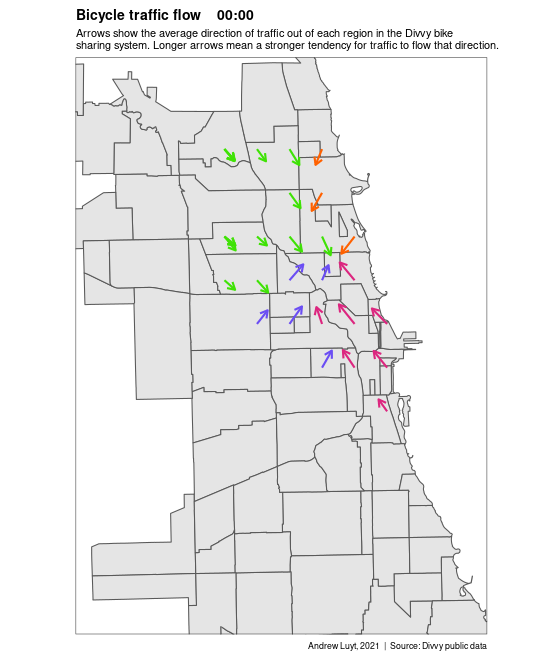
Average traffic flow
Each arrow on the map below represents the averaged motion of all the bikes in a region during a 10-minute period. The stronger the trend, the longer the arrow.
Technical note: to calculate this metric, each trip is treated as a vector from start station to end station. All vectors in a particular region in a particular period of time are added end-to-end and the final vector is treated as the overall traffic flow.

When we look at the overall traffic flow for the city, it is remarkably consistent. Traffic mostly flows in to the waterfront from all directions, and flows out from the waterfront either to the northwest or southwest, depending how far north the riders are.
Now we’ll zoom in on the area with the most activity to get a better look. We’ll also show data at individual bike stations, rather than a regional average like we did above.

At this level of detail the traffic flow is more disorderly yet the same overall pattern is visible. On average, Divvy users ride in to the waterfront from the western parts of the city, riders on the southern waterfront travel northwest, and riders on the northern waterfront travel southwest.
A special case: pleasure cruises?
For the traffic flow analysis we removed trips that start and end at the same station since, lacking minute-by-minute GPS data, they have an apparent distance of zero and no direction. We believe it’s likely that pleasure cruises make up a large portion of these rides.
| Rider Type | Pleasure cruises | Avg trip minutes | Percent of trips |
|---|---|---|---|
| casual | 287293 | 61 | 15.5% |
| member | 96348 | 26 | 3.9% |
These round-trips represent about 10% of all bike use and about 15% of all casual use. We also see above that casual users outnumber members 3 to 1 in this interesting subset of rides.
If our hypothesis is correct, the percentage of this type of ride should shrink in winter and grow in summer and be mostly confined to casual users. This first graph shows exactly this pattern.

Second, if our idea is correct we should also see trip duration becoming longer in summer and shorter in winter. This should strongly affect casual users but have little effect on members, who have a 45-minute time limit. This graph demonstrates this pattern as well.

Now let’s map the location and average duration of these trips.

This map clearly identifies that the entire waterfront is the most popular zone for pleasure cruising. There is a notable secondary route stretching northwest, inland from the waterfront. Finally we’ll animate the average duration and locations of these cruises.

These trips seem to follow a similar pattern to all other traffic in the city, though perhaps more concentrated on the waterfront.
Going further to learn how these rides differ in destination, length, or speed would require some sort of GPS tracking data from the bikes, which is outside the scope of this dataset. For now we note the strong possibility that about ten percent of all trips are taken for enjoyment rather than travel, and that casual users dominate this market segment.
Other observations
How do trip distances vary?
This is a bit surprising. For trips that start and end at different stations, the average trip is about the same distance for both classes of users, about two and a half kilometers.

How much time is spent on an average ride?
Casuals ride more than twice as long as members, on average.

Examining the distribution of ride lengths, we find the expected pattern: most trips are close to average length, but a significant number of casual trips can be over an hour long.

We can see the effect of the 45-minute time limit for members: almost no members exceed it.
Seasonally, casual rides have a large amount of variation. The small number of winter trips taken tend to be short - half the length of rides at the peak of summer.

Speed
We’ve seen that casuals and members ride about the same distances, but members spend less time on the bikes. The graph below shows that members are about 30% faster on average.

Riding time
We now know that members ride more often and casuals ride longer - so who rides the most total minutes? Casual users do!

This represents a total of over 45,000 days of bike riding for casual users and more than 25,000 days for members in the past year alone.